Monday, May 21, 2007

Another design project

Here's another assignment from Nicole, the design teacher:

Typographic Portraits

You will be assessed on your ability to:

Receive and interpret this brief

Generate a range of graphics in response to the concepts.

Hand work in on time and in the appropriate format.

TEACHER / ASSESSOR: Nicole Welch

DUE DATE: 5th June

RESULTS WILL BE PRESENTED AS A:MARK

DESIGN BRIEF:

Typography is the definitive tool for the designer and most design solutions can be found through an effective use of text. For this exercise you should try to move beyond the literal and take a more conceptual approach. You must use your own name for each of the following business card designs. This set’s limits on your use of words to solve the problem and you must instead find a creative visual solution.

Create a business card for each of the following personalities, using your own name each time. The text for each should read: (see examples.)

  1. My name is (your name) and I’m a Chameleon
  2. My name is (your name) and I’m an Acrobat
  3. My name is (your name) and I’m an Amphibian
  4. My name is (your name) and I’m a Taxi Driver
  5. My name is (your name) and I’m a TV Evangelist
  6. My name is (your name) and I have an Allergy
  7. My name is (your name) and I live in a nuclear fallout area
  8. My name is (your name) and I have the Hiccups
  9. My name is (your name) and I’m Accident prone.
  10. My name is (your name) and I’m a Magician.

In each design it is your name that will take on various visual attributes of the thing described.

Your graphics must share the same ratio as an actual business card but must be larger and at 300 DPI.


Image: 'untitled'
www.flickr.com/photos/13584435@N00/498752523
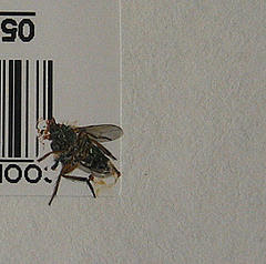
Bug Crushing

This week we'll be looking at squashing bugs.

First up though, you might enjoy finding out if you've got the makings of a programmer

Don't sweat it if it turns out you should be tending gardens instead of web sites, I haven't met anyone who couldn't do this stuff yet (just a few who can't seem to enjoy it much - go figure :-)

In my experience, the folks who enjoy programming the least are those who haven't got the hang of debugging.

The simple truth is that half your development time is going to be spent tracking down and fixing bugs, and the quicker you can do this the better you're going to feel about the whole coding thing.

So, without further preamble, here's a couple more sites describing the fine art of debugging JavaScript with firebug:

Finally, here's some Debugging Challenges for you to practice on. Once you've tried out a few, take a turn at creating one of each of the four bug types identified on the Wikiversity page.


Wednesday, May 16, 2007

firebug


This week we're going to start on a new subject: 'Locate equipment, system and software faults' (also known by its friends as ICAT4221A). You can read the gory details on the Training Packages Unwrapped site

If you've started doing any of the JavaScript challenges you should have plenty of material that needs troubleshooting :-) what I would like to do here is introduce a tool that will help with your fault finding.

It's a firefox extension called firebug - you'll need to install it and restart firefox before you can continue. Then have a look at the following couple of movies:

Once you've seen these, try setting a breakpoint and stepping through some of the JavaScript code you've written so far. Once you've gotten the hang of it, try introducing an error or two to see how firebug reacts.


Image: 'Grumpy'
www.flickr.com/photos/95118988@N00/217217600

Wednesday, May 09, 2007

a little mixed up

If you followed through the javascript exercises I recommended last week, you might have had some problems with the final parts of lesson 3 - turns out there were more than a couple of coding horrors buried there.

I won't spoil all your debugging fun by listing them, but here's some hints:

- strings must start and finish with the delimiter (a ' or a ") but cannot include that delimiter inside the string (unless you do some tricky escape character thing - look it up if you need to know how).

- if you use else if statements then the program will quit checking after the first if statement it finds to be true.

- the final if statement is all twisted up, and your error message won't show up properly if you run it the way its written.

And now, upwards and onwards...

it's time to look a little deeper into manipulating the document object model (DOM to its friends). Work through the javascript basics lessons six and seven. Then have a crack at these JavaScript challenges. Let me know how you get on with an upload and blog post . Don't rush this, there's some deep thinking required - but master it and you'll be on top of the client scripting pinnacle of fame :-)


Image: 'MichaelwheredyougetthosepeepersHQ'
www.flickr.com/photos/90732224@N00/367500518

image mapping


tying up a loose end in the html subject, we looked at image mapping - defining 'hotspots' on an image which become hyperlinks to other pages.

not particularly useful imo, but worth knowing about.

you can read up on the creature on the HTML code tutorial site, and if you're not too interested in coding by hand, Rany's found a great online tool that will ease the pain: the HTML-Image map Creator WYSIWYG

to practice, find a creative commons licensed image using flickrCC, build a web page around it and create some hyperlinks off it to relevant wikipedia articles. The example we used in class was a map with links to relevant cities/states, but any image offers possibilities - e.g. linking the eyes of a portrait to the article on eyes in wikipedia, let your imagination run with it.

Don't forget to add the attribution for your image.

As always, upload, add a link from your exercises page, and blog to let me know there's something to look at.


Image: 'Lost'
www.flickr.com/photos/25159586@N00/48302937

4x4


I just found out that the (X4) next to each of the topics in the Black Squares exercise mean that you'll need to create 4 images for each topic - that's 24 images in all - 96 black squares - 79,040 pixels

have fun.


Image: 'IMG_3116'
www.flickr.com/photos/15066227@N00/36422830

Wednesday, May 02, 2007

looking into forms


The first screen you'll need to build for a login application will be a simple form that asks for a user name and password.

To save the server unneccessary work, and your web visitor unneccessary delays while they wait for an answer, it would be good to have some way of preventing the form from being submitted until the visitor has entered both a name and a password.

We do this by writing some client side script which checks the form before it gets sent to the server. If it finds that either the name and/or the password fields are blank it should alert the user and let them remedy the situation before sending the form off.

Here's a blow-by-blow analysis...

Calling a script when the submit button is pressed

First we need a function to call. In the head section of your login form page, add the following script:


function validateForm(){
alert('we're now validating the form');
}

</SCRIPT>

And in the form tag of your page add an ONSUBMIT attribute that calls the function:

<FORM ONSUBMIT="return validateForm();">

Onsubmit is an 'event' that gets called when someone clicks on the submit button for a form. Try this out in your form and you should see an alert box when you click on the submit button.

Preventing the form from being submitted

If you had sharp eyes you might have noticed that the value for the onsubmit attribute said: "return validateForm();" - it returned a value picked up from the validateForm function to the browser.

If that value is 'false' then the browser will not process the form any further.

Don't just take my word for this, try it out by adding the following line to your validateForm function:

function validateForm(){
alert('we're now validating the form');
return false;
}

Now try submitting your form with some values in it and you should see that they stay there when you try to submit the form. It won't get submitted because you're passing the 'false' value that validateForm sends back through to the browser.

Checking for a form value

All well and good so far, but we still haven't got anything that checks the value our user's typed into the form.

To do this we need to add a little more code.

Firstly, we'll need to be able to identify our form elements. We do this by adding id attributes to the input tags, something like:

<input type="text" id="name" />

We can see the value in this field now by calling a JavaScript function: getElementById.

Try it by replacing your validateForm function with the following code:

function validateForm(){
alert('hello '+document.getElementById('name').value);
return false;
}

Type something in the name field of the form and submit it and you should see the name pop up in an alert box.

Go ahead now and add an ID and some JavaScript code to show the password in the same way.

Checking for empty fields

From here it's a simple task to check for an empty field and optionally show an error message.

Try this code in your validateForm function...

function validateForm(){
if (document.getElementById('name').value == '') {
alert('you must enter a user name');
}
return false;
}

Test it with and without anything in the user name field, then add some code that checks for a password in the same way.

Reducing user frustration

If you've gotten this far you probably have a script that brings up two alert messages if the user submits with both fields empty.

It would be better to just show one message with all the errors listed together. It would also be good if the form submitted properly when they've entered the required information.

We can kill these two birds by building an error message string during the testing phase of our script, and then either displaying the error message if there is one, or returning 'true' and allowing the form to be submitted if there is no error message to show.

It should look something like this:

function validateForm(){
var errormessage = '';
if (document.getElementById('name').value == '') {
errormessage = 'you must enter a user name';
}
if (document.getElementById('password').value == '') {
errormessage += 'you must enter a password';
}
if (errormessage == '') {
retrun true;
} else {
alert(errormessage);
return false;
}
}

What?

Let's look at what's going on here.

We start out by creating a variable called errormessage and assigning it an empty string (the two single quote marks side by side)

Then we look to see if there's any user name entered. If there isn't, we set the error message to prompt the user for one.

Next we check for a value in the password field. This time, if we find nothing, we add a message to whatever is already in the errormessage variable. By using the += we're telling the program to add a string to anything that's already in the variable.

Finally, we check to see if there's anything in our errormessage variable. If there isn't we return true, which will tell the browser to go ahead and submit the form.

If there is a message, we display it and return 'false', preventing the form from being submitted.

Try it out. Add the code and test it with the 4 scenarios (nothing etnered; name or password only entered; and both name and password entered)

Postscript

Just one little bit of tidying up to do.

Right now the error message for the 'nothing entered' case looks a bit ugly. To get the error messages appearing on seperate lines we need to add the newline character to our first error string:

errormessage = 'you must enter a user name\n';

There, now it's perfect :-)

Further reading

If you've still got some JavaScript curiosity left, I've put some pages up for you to read through. Try the first three JavaScript primers then take a well earned break.


Original image: 'The thief eats a seed'
www.flickr.com/photos/11334344@N00/124302244
by: Bob Travis

another piece of the puzzle


Continuing our 'intro to programming' series, here are a couple more worksheets...

Once again, try implementing your solution in JavaScript - upload and let me know where I can see it :-)


Image: 'Ice form'
www.flickr.com/photos/65919269@N00/218966763

designing - outside the box


I'm still worrying about the arty side, and asked what the other web students were up to. It turns out they've got an assignment. Here's the brief:

THE BLACK SQUARE PROBLEM

You will be assessed on your ability to:

  • Receive and interpret this brief
  • Generate a range of graphics in response to the above concepts.
  • Hand work in on time and in the appropriate format.
TEACHER / ASSESSOR: Nicole Welch

DUE DATE: 15th May

RESULTS WILL BE PRESENTED AS A: Grade
This assessment is Grade code 72:
Distinction 83% to 100%
Credit 70% to 82%
Pass 50% to 69%

DESIGN BRIEF:
Using only four black squares for each design, create graphic images to express the meaning of each of the following six words:

  1. Order (X4)
  2. Increase (scale) (X4)
  3. Bold (X4)
  4. Congested (X4)
  5. Tension (X4)
  6. Playful (X4)

Consider the following principles to help you find creative solutions:
Framal reference, touching, overlapping, cropping, contrast of size and the dynamics of negative –positive relationships.

SPECIFICATIONS

Each graphic must be:
  • Created in Photoshop and saved as a JPEG or GIF.
  • 10cm x 10cm
  • 72 DPI
Note: Always keep a copy or record of your assignment. Loss or misplacement of your assignment will not be accepted as an excuse for non-submission.

I'm pretty sure we can manage this one online too - with a few minor adjustments :-)

For starters, I'm not overly concerned about what graphic editing package you use. My personal preference would be the Gimp, but use whatever you're comfortable with.

Also, I'd like you to experiment a bit with the presentation. You could try some JavaScript gallery script to create a page of your own, or upload the images to flickr and make a slideshow there, then look for scripts that you can include on your own web pages to display the flickr slideshow - do a search for options. As always - put a post on your blog with a link to your efforts (and some comments on what you've learnt along the way).

Nicole also had a little exercise for you to try. Take a look a some of the sites featured on web pages that suck - pick your two favourites and link back to them in a blog post about what you hate about them most (or find a couple all by your lonesome and write about them instead). Then do the same with two sites that you admire. You might start your search by browsing through this flickr photoset. Once again, link back to them in a blog post about what you like about these sites.


Image: 'a crowd'
www.flickr.com/photos/48553010@N00/111126800