Tuesday, April 11, 2006

toolboxin' around


before taking off for our easter break, we did a little more work on the toolbox:

  1. finished moving the 'requirements', 'installation guide', 'credits' and 'disclaimer' links from the old start page to the shared_files/nav_panel.html file
  2. removed the tables from nav_panel and replaced them with unordered list elements
  3. updated shared_files/css/nav_panel.css - adding code for a background image, and some showy looking code to display our new list as a set of buttons (we took some original code from listamatic and 'adjusted' it to suit our page)
  4. tinkered a little with shared_files/frameset.html so that we didn't get the annoying scroll bars along the bottom of each frame.
If you don't want to code the html yourself, the updated files are available at http://www.bathurst-tafe.nsw.edu.au/~pshanks/webdevToolbox
(or http://192.168.201.2/~pshanks/webdevToolbox if you're inside the firewall)

by rights we should probably do another little usability test to check that our changes have worked - perhaps next term...

while on the topic of next term, here's the next few items on the redesign things-to-do list:
  • move (and possibly re-name) the links at the bottom of the writing basic html page
  • split up the webdevmag html for writing basic html into bite sized pieces (possibly adding some more content)
  • prevent these pages from opening in new windows
  • add some navigation elements so that our new pages show up in the breadcrumb trail and main navigation
  • re-design the top frame
  • update the credits page to add our names :-)
have a good break, see you in may (thanks to Easternblot for the Chocolate bunny pic).

Sunday, April 09, 2006

background briefing


One of the first things we'll be changing on the web development toolbox is the background - this can be an image or a colour or both.

For an overview of how this can be done using html, see the echoecho.com tutorial


If you're keen to put a background image on your pages, you might want to chose one from backgroundcity or roll one from scratch at the absolute background textures archive

As an exercise:

  1. Create an index.html page with a background colour #FF0000

  2. Put this background image on it from the absolute background textures archive's red border page

  3. Add a table and apply the cloud image above as a background (right click on the clounds and chose 'save image as...' from the popup menu).

  4. Set one cell's background colour to #00FF00.

  5. Finally, upload the html and picture files into a new directory on your website called background.

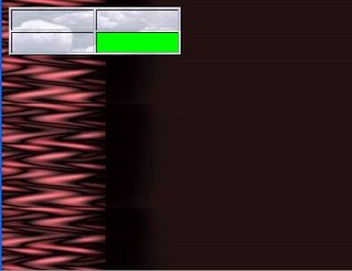
You should have ended up with something that looks like this:


Ugly but illustrative. Unfortunately, the html bgcolor and background attributes have now been depricated in favour of CSS, but the exercise does give a good grounding for the tizag page on CSS backgrounds

Q: where would we add background information for our redesigned web development site?

Friday, April 07, 2006

redesigning the toolbox

The usability study

What was your initial impression of the toolbox?

Could you tell what it was all about? Did you find a good road map for navigating through the content?

Was navigating to the correct section effortless or did you get lost along the way (or, like some of us, find it hard to even start)?

Was it easy to find the information you were after? Did you use the search function? The main navigation and the links to more information? Where they all well labled and obvious, or did cutesy language get in the way of understanding what lay at the other end of the links?

I think we all had some trouble at one point or another. For me, I had to think too hard about how to use the toolbox, and it didn't leave me with enough free brainpower for using the content.

What we did about it

To start with, we went for the 'low hanging fruit' - those changes which would be easy to implement but which would give the most obvious results. For a start, we renamed the index.html file and took the frameset.html file from the shared_files directory and copied it into the root directory of the site as our new index.html.

So that the links work we had to edit the file (adding "shared_files/" to the beginning of all the URLs in it). If you don't want to code the html yourself, the updated files are available at http://www.bathurst-tafe.nsw.edu.au/~pshanks/webdevToolbox/webdevToolbox20060403.zip
(http://192.168.201.2/~pshanks/webdevToolbox/webdevToolbox20060403.zip if you're inside the firewall)

So now the first page we see when we start the toolbox is the welcome message from arachnoid web services. It's still not perfect, but a whole lot better than 2 spash screens and a popup window. I would have perferred to have more orientation, but the actual orientation page was so light on information it wasn't a candidate. We'll just have to add more content to the welcome message later.

Because the original spash pages had some links to credit, setup and teacher oriented pages on them we have to add them back into the program somehow. The obvious sopot was the left hand navigation frame, so we made a start on that.

Next we hope to complete the re-design of the main navigation, and do some tinkering with the CSS to change the look and feel of the whole site with a minimum of effort. To that end, please take a look at some of the CSS showcases out there and pick a likely looking design for analysis and imitation (The CSS Gallery, Layout Gala, CSS Beauty
, and css Zen Garden
could all be worth a visit)

results just in...

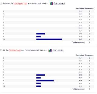
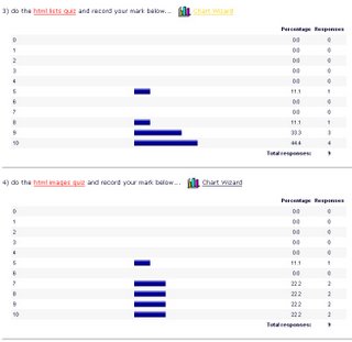
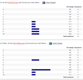
Here are the results from last week's html quiz and survey (click on the image if you need an enlargement):


The basics looked good, but perhaps we need a little more work on text elements.


Most of you were OK on lists, but patchy results on images.


Links could do with some more attention too, and a couple of you will need to revise with a tables lesson.


So, what did you think?

Do you want another face to face session on any of these areas, or could you muddle through with the tutorials I've linked to here? Post a comment if you feel strongly either way.

Sunday, April 02, 2006

A site redesign project

These days it's becoming a common task to redesign existing web sites.

I couldn't see anywhere in the current syllabus that this was being addressed, so I've decided to munge it into the modules I'll be teaching here.

For our subject, we'll take TAFE's own Web Design toolbox. If you don't have a copy you'll have to drop me a line so I can send you the CD.

This resource was created in 2002, and in my opinion is ripe for an update. We'll take it in tiny little steps and see how far we can go.

To start off we'll do a mini usability test to see how suitable the toolbox is for achieving the 'Create a Mark Up Language Document' learning outcomes.

First: download these usability test forms:
Post-Session Survey (PDF)
Observation Form (PDF)

Second: find a victim volunteer, and sit them down in front of a computer running the toolbox.

Third: have them run through some simple exercises and watch carefully for events that make them stop and think - these are the opportunities we'll be exploiting for improving the interface. As you observe, fill in the observation form.

Finally: after the exercise, have your subject fill in a post-session survey. If you're doing this exercise in class swap roles half way through so you both experience the process as a tester and observer.

Here are some sample exercises you might set your subject using the module learning outcomes:

  1. Open the toolbox and navigate to the section called 'Write basic HTML'
  2. Navigate to the orientation section and find what link will tell you how to use the toolbox.
  3. Try the link. Did it tell you enough to confidently use the toolbox?
  4. Return to the 'write basic html' section.
  5. Can you find what competencies you're expected to master in this module?
Half time, swap roles if you're doing this exercise with another student and then complete the following tasks:
  1. Can you find the section in the WebDevMag that explains how to add hyperlinks to a document? Is there enough detail here for you to understand the anchor tag?
  2. Can you find the spider.gif mentioned on page 3 of the WebDevMag?
  3. Close the WebDevMag window.
  4. Find out from the chief programmer if there's any way to change the spacing between paragraphs.
  5. Go to the 'Read other resources about basic HTML programming' section and visit the site: 'Barebones Guide to HTML'
For bonus marks, run through the section: 'Test your knowledge of basic HTML programming' and note any problems with the questions or interface.

By now you should have a good idea about how the toolbox works, and what parts of the interface design you might want to change. It's time for some brainstorming and planning...

Frames

Before we start I feel I should warn you: there's no very good reason for you to create pages that contain frames.

Way back in 1996, Jakob Nielsen wrote Why Frames Suck and nothing's changed to make them any less sucky since then. (Want more? Have a look at the international I hate frames club)

That being said, you still need to know about HTML frames because

  1. Your website could be caught in someone else's frameset

  2. You might have to work on a pre-existing web site based on frames, and

  3. it's in the syllabus :-)

So, what is a frameset? Have a look at QuirksMode for an example. Use the site to see how the use of frames affects it, then look at the page source.

Why would a modern site about JavaScript, CSS and the W3C DOM use frames? It's hard to find pros, but frames do have some advantages.

Wanna build a frameset of your very own? Let's have a look at what W3Schools have to say

That should be all we need to know about building frames.

Now, let's see about escaping from other people's framesets.

Why is being stuck in a frameset such a problem? Have a look at this exercise and you'll get to see first hand. And here's how to go about escaping a frameset