Sunday, May 07, 2006

Forms, CGI and PHP

Last week we played with some nifty form elements. If you missed the action, or just want to revise, the W3C have the definitive word on forms here, or you can find a gentler introduction on w3shools.

This week we'll try to implement a simple form. See if you can re-create the following useful web page:


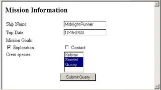
Set the form's action attribute to point to dump-globals.php - which you can pick up from either here (if your outside the TAFE lab) or here (if you're inside the firewall).

Copy your new web page and dump-globals.php onto the bathurst-tafe web server, set the permissions, and test the page using both GET and POST methods.

If you have the time, you might want to see how to
create forms using CSS

Tuesday, April 11, 2006

toolboxin' around


before taking off for our easter break, we did a little more work on the toolbox:

  1. finished moving the 'requirements', 'installation guide', 'credits' and 'disclaimer' links from the old start page to the shared_files/nav_panel.html file
  2. removed the tables from nav_panel and replaced them with unordered list elements
  3. updated shared_files/css/nav_panel.css - adding code for a background image, and some showy looking code to display our new list as a set of buttons (we took some original code from listamatic and 'adjusted' it to suit our page)
  4. tinkered a little with shared_files/frameset.html so that we didn't get the annoying scroll bars along the bottom of each frame.
If you don't want to code the html yourself, the updated files are available at http://www.bathurst-tafe.nsw.edu.au/~pshanks/webdevToolbox
(or http://192.168.201.2/~pshanks/webdevToolbox if you're inside the firewall)

by rights we should probably do another little usability test to check that our changes have worked - perhaps next term...

while on the topic of next term, here's the next few items on the redesign things-to-do list:
  • move (and possibly re-name) the links at the bottom of the writing basic html page
  • split up the webdevmag html for writing basic html into bite sized pieces (possibly adding some more content)
  • prevent these pages from opening in new windows
  • add some navigation elements so that our new pages show up in the breadcrumb trail and main navigation
  • re-design the top frame
  • update the credits page to add our names :-)
have a good break, see you in may (thanks to Easternblot for the Chocolate bunny pic).

Sunday, April 09, 2006

background briefing


One of the first things we'll be changing on the web development toolbox is the background - this can be an image or a colour or both.

For an overview of how this can be done using html, see the echoecho.com tutorial


If you're keen to put a background image on your pages, you might want to chose one from backgroundcity or roll one from scratch at the absolute background textures archive

As an exercise:

  1. Create an index.html page with a background colour #FF0000

  2. Put this background image on it from the absolute background textures archive's red border page

  3. Add a table and apply the cloud image above as a background (right click on the clounds and chose 'save image as...' from the popup menu).

  4. Set one cell's background colour to #00FF00.

  5. Finally, upload the html and picture files into a new directory on your website called background.

You should have ended up with something that looks like this:


Ugly but illustrative. Unfortunately, the html bgcolor and background attributes have now been depricated in favour of CSS, but the exercise does give a good grounding for the tizag page on CSS backgrounds

Q: where would we add background information for our redesigned web development site?

Friday, April 07, 2006

redesigning the toolbox

The usability study

What was your initial impression of the toolbox?

Could you tell what it was all about? Did you find a good road map for navigating through the content?

Was navigating to the correct section effortless or did you get lost along the way (or, like some of us, find it hard to even start)?

Was it easy to find the information you were after? Did you use the search function? The main navigation and the links to more information? Where they all well labled and obvious, or did cutesy language get in the way of understanding what lay at the other end of the links?

I think we all had some trouble at one point or another. For me, I had to think too hard about how to use the toolbox, and it didn't leave me with enough free brainpower for using the content.

What we did about it

To start with, we went for the 'low hanging fruit' - those changes which would be easy to implement but which would give the most obvious results. For a start, we renamed the index.html file and took the frameset.html file from the shared_files directory and copied it into the root directory of the site as our new index.html.

So that the links work we had to edit the file (adding "shared_files/" to the beginning of all the URLs in it). If you don't want to code the html yourself, the updated files are available at http://www.bathurst-tafe.nsw.edu.au/~pshanks/webdevToolbox/webdevToolbox20060403.zip
(http://192.168.201.2/~pshanks/webdevToolbox/webdevToolbox20060403.zip if you're inside the firewall)

So now the first page we see when we start the toolbox is the welcome message from arachnoid web services. It's still not perfect, but a whole lot better than 2 spash screens and a popup window. I would have perferred to have more orientation, but the actual orientation page was so light on information it wasn't a candidate. We'll just have to add more content to the welcome message later.

Because the original spash pages had some links to credit, setup and teacher oriented pages on them we have to add them back into the program somehow. The obvious sopot was the left hand navigation frame, so we made a start on that.

Next we hope to complete the re-design of the main navigation, and do some tinkering with the CSS to change the look and feel of the whole site with a minimum of effort. To that end, please take a look at some of the CSS showcases out there and pick a likely looking design for analysis and imitation (The CSS Gallery, Layout Gala, CSS Beauty
, and css Zen Garden
could all be worth a visit)

results just in...

Here are the results from last week's html quiz and survey (click on the image if you need an enlargement):


The basics looked good, but perhaps we need a little more work on text elements.


Most of you were OK on lists, but patchy results on images.


Links could do with some more attention too, and a couple of you will need to revise with a tables lesson.


So, what did you think?

Do you want another face to face session on any of these areas, or could you muddle through with the tutorials I've linked to here? Post a comment if you feel strongly either way.

Sunday, April 02, 2006

A site redesign project

These days it's becoming a common task to redesign existing web sites.

I couldn't see anywhere in the current syllabus that this was being addressed, so I've decided to munge it into the modules I'll be teaching here.

For our subject, we'll take TAFE's own Web Design toolbox. If you don't have a copy you'll have to drop me a line so I can send you the CD.

This resource was created in 2002, and in my opinion is ripe for an update. We'll take it in tiny little steps and see how far we can go.

To start off we'll do a mini usability test to see how suitable the toolbox is for achieving the 'Create a Mark Up Language Document' learning outcomes.

First: download these usability test forms:
Post-Session Survey (PDF)
Observation Form (PDF)

Second: find a victim volunteer, and sit them down in front of a computer running the toolbox.

Third: have them run through some simple exercises and watch carefully for events that make them stop and think - these are the opportunities we'll be exploiting for improving the interface. As you observe, fill in the observation form.

Finally: after the exercise, have your subject fill in a post-session survey. If you're doing this exercise in class swap roles half way through so you both experience the process as a tester and observer.

Here are some sample exercises you might set your subject using the module learning outcomes:

  1. Open the toolbox and navigate to the section called 'Write basic HTML'
  2. Navigate to the orientation section and find what link will tell you how to use the toolbox.
  3. Try the link. Did it tell you enough to confidently use the toolbox?
  4. Return to the 'write basic html' section.
  5. Can you find what competencies you're expected to master in this module?
Half time, swap roles if you're doing this exercise with another student and then complete the following tasks:
  1. Can you find the section in the WebDevMag that explains how to add hyperlinks to a document? Is there enough detail here for you to understand the anchor tag?
  2. Can you find the spider.gif mentioned on page 3 of the WebDevMag?
  3. Close the WebDevMag window.
  4. Find out from the chief programmer if there's any way to change the spacing between paragraphs.
  5. Go to the 'Read other resources about basic HTML programming' section and visit the site: 'Barebones Guide to HTML'
For bonus marks, run through the section: 'Test your knowledge of basic HTML programming' and note any problems with the questions or interface.

By now you should have a good idea about how the toolbox works, and what parts of the interface design you might want to change. It's time for some brainstorming and planning...

Frames

Before we start I feel I should warn you: there's no very good reason for you to create pages that contain frames.

Way back in 1996, Jakob Nielsen wrote Why Frames Suck and nothing's changed to make them any less sucky since then. (Want more? Have a look at the international I hate frames club)

That being said, you still need to know about HTML frames because

  1. Your website could be caught in someone else's frameset

  2. You might have to work on a pre-existing web site based on frames, and

  3. it's in the syllabus :-)

So, what is a frameset? Have a look at QuirksMode for an example. Use the site to see how the use of frames affects it, then look at the page source.

Why would a modern site about JavaScript, CSS and the W3C DOM use frames? It's hard to find pros, but frames do have some advantages.

Wanna build a frameset of your very own? Let's have a look at what W3Schools have to say

That should be all we need to know about building frames.

Now, let's see about escaping from other people's framesets.

Why is being stuck in a frameset such a problem? Have a look at this exercise and you'll get to see first hand. And here's how to go about escaping a frameset

Thursday, March 30, 2006

an HTML survey

I've put together a survey to see how much we've learnt about basic html so far.

It's a set of links to 6 quizzes on the following html subjects:

  • HTML Basics
  • Text
  • Lists
  • Images
  • Links
  • Backgrounds
  • Tables

Each quiz consists of 10 multi-choice questions. After taking each quiz record your mark on the survey.

These marks are not linked to you in any way, and won't be used for any assessment. I'm just interested in what areas we need to re-visit (if any), and how much you've learnt over the last few weeks as a group. So please don't just make up marks or re-send the survey. If you're not interested, just skip it.

To do all the quizzes and record the marks should take about 30 minutes.

Please note: when you click on the quiz links on the survey they will open in a new window. You may be told that you have a previous survey already open. If this happens, click on cancel to get to the new quiz.

Click here to do the quizzes and take the html survey, and have fun.

Tuesday, March 28, 2006

Validate Website Performance - an introduction

This week we started to look at how we'd 'validate website performance'

Initially this entails learning about how to make websites that don’t suck. So far we’ve been learning all about how make websites work, now we’re going to look into what makes them work well.

To kick off, we had a think about what things annoyed us on the web. I didn't write any of these down, but you've probably got a pretty good list yourself.

If not, have a think about it now. Have a look at this website for some inspiration

Don't for a minute imagine that this is just a feel-good exercise - in 2004 a study of the U.S.A.’s online railroad booking service showed that poor website performance was costing Amtrak a cool $16 million dollars a year in lost revenue. Wouldn’t you just love a slice of that pie?

Come up with a good list of annoyances?

Here's a couple of lists made by other folks:

Check out:

Jakob Nielsen –
Top Ten Web Design Mistakes of 2005:
http://www.useit.com/alertbox/designmistakes.html
and his Top Ten Mistakes in Web Design:
http://www.useit.com/alertbox/9605.html
finally, a site dedicated to Web pages that suck:
http://www.webpagesthatsuck.com

We then went on to investigagte a few annoyances in more detail...

Usability

One of the recurrent themes is usability: poor navigation, inadequate search, bells and whistles getting in the way of the site's functionality, colour clashes - the list goes on.

How would you measure usability?

Read through this macromedia article and see what you could add to your own web site development toolbox:

http://www.macromedia.com/devnet/dreamweaver/articles/dwmx_design_tips.html


What if the web page can’t display at all?

Use html validation. Download, install and run html validator for firefox on some of your own pages:

https://addons.mozilla.org/extensions/moreinfo.php?id=249&application=firefox

Broken Links

Any excuse?
How can you avoid them?
How often should you check?

Download, install and run Xenu’s link sleuth on your own Bathurst-tafe pages:
http://home.snafu.de/tilman/xenulink.html


and that was about it for this week. Coming up: Site response times and stress testing.

Sunday, March 26, 2006

Variable width CSS layouts.

Flushed with last week's successful foray into using CSS for page layout, we move on from a fixed width, 2 column design to 3 variable width columns, as explained in Liquid layouts the easy way: "one method of achieving a successful liquid layout as well as providing basic definitions of liquid, fixed-width and em-driven layouts"


Sunday, March 19, 2006

CSS layout

This week we're looking into how to use css lay out page content (rather than using tables).

To start (and probably end with) we'll be working through a comprehensive CSS layout tutorial by enlighten designs

If you have the time, I'd recommend you read through Kevin Hale's excellent article: An overview of current CSS layout techniques

If you don't have the time, perhaps you should just use a CSS layout genrator. Something like the layout-o-matic or little boxes

Finally, try to re-create the table exercise posted on Sunday, March 12 2006 but using CSS layout instead of the outer table

Assignment: 3756X - Emerging Web Technolgies and Standards

Find your blog in the table below and write a post about the technology or web standard marked. Your post should be a few hundred words in length and include links to relevant web sites. These sites should also be added to your del.icio.us account with at least the standard/technology name and 3756X as tags.

Some places you might go to start your research:


Once you have written your entry, you need to visit the other blogs in the table and add comments to their 3756X blog entries. The comments must be on topic and constructive: asking questions, adding information, making clarifications and suggesting extra links would all be suitable comments.

Your initial blog entry should be completed by Monday 27th March, with all comments left by the following week (Monday 3rd April) - setting up a bloglines group might make this easier by allowing you to easily see when each of the other blogs have been updated.


3755assignment

Bennji

Bog

Brads Page

Brettos Blunder

chris - MySpace Blog

cragio

Dann Lost His Camel

Justin's Blog

MattSplog

School Days

Sharon's Blog

Tafe Blog

HTTP

X


SMTP


X


CGI


X


MIME


X


SHTTP


X


SOAP


X


W3C


X


IEEE


X


ECMA


X


HTML


X


XML


X


DOM


X


XHTML


X

Tuesday, March 14, 2006

an html editor

This week we decided to move on from hand coding all of our html by installing and using a purpose built text editor: editplus

Once you install the latest version, it would be helpful to also install the template and tagset for XHTML transitional from the user files section (I used xhtml_1.zip an XHTML ctl and template by Jim Granger) - unzip this into your Program Files/editplus directory

To use the template, just click on File - New and select html

To see the XHTML specific tags you will need to select xhtml from the dropdown box on the cliptext tab on the left.

a wikispace for Cert IV web stuff

In an idle moment last weekend I set up a wikispace for some of our Cert IV web subjects: http://certivweb.wikispaces.com/.

If you haven't come across a wiki before, they're an interesting web based application that allows anyone to edit the page contents. The most famous wiki would have to be the wikipedia (where you can find out more about what a wiki is)

Currently, most of the pages on the certivweb wiki are generated from del.icio.us RSS feeds, but there is one page with some more information: the page devoted to 3756X - Emerging Web Technologies - where you'll find the subject outline and learning objectives along with some relevant links.

Next week we'll be dividing up these objectives and writing blog entries on them, so have a look through the list and some of the links to give yourself a handle on where we'll be going.

Sunday, March 12, 2006

A table exercise

Try re-creating the following page (click on the image for a bigger, more readable picture)


Monday, March 06, 2006

Tables

Today we created a bunch of tables

in the dim dark past, way back in the early parts of this century, people used tables extensively for page layout; putting headers, navigation bars, content and footers into various cells. now, of course, we would use CSS, but its inportant to realise that there are plenty of table based pages still out there - some of which you might have to work on in the future.

tables are still very useful for displaying tabular data in a spreadsheet like layout. things like telephone lists.

to see how tables work have a look at the html code tutorial on tables - the navigation's a bit iffy, but it's worth ploughing through up to and including the css background section; just click on the next page link on each page

for more: see the w3schools tables page

creating an index.htm file

a fact I've neglected to mention: if a directory has an index.htm file in it, this file will be displayed by default. So if you visit my directory: /~peter you'll see the index.htm file that's there.

Exercise:

  1. Create a new directory in your public_html space called exercises

  2. upload the list exercise you completed today and the image and css files we created last week

  3. create a new page: index.htm with links to the two exercises

  4. test your page by entering http://www.bathurst-tafe.nsw.edu.au/~yourname/exercises into your browser address bar. note that the web server will send you the index.htm file by default if you don't add any specific page name to the URL


A list exercise

For today's exercise I'd like you to recreate the following list, displayed here in three pictures (you might need to click on the third image to read it):


Some hints for minimising the pain:

  1. Create the outer lists first. For example, create an ordered list with three list elements for "history, tags, design and text", "Using CSS, Images and Links" and "Lists. There are 3 sorts of lists", then test it before filling in the next nested list

  2. Whenever you type in an open a tag, type the matching closing tag, then fill in the text between them, that way you won't get lost in your open tags

  3. to show a < character use the special character &lt; - for a > use &gt;